BREWZERKER Beverage Co.
WildBoar Stout
Alcohol Beverage Brand Design
A locally-crafted beer with a distinct “wild side” and unique family story, all under the same cap. The driving concept behind this beverage comes from a fundamental misunderstanding of the co-founder’s own name, Wilbur, and his penchant for Wild Canyon Hops. Commonly associated with the harmless, lovable pig of Charlotte’s Web fame, the name Wilbur comes from Middle English which translates to, “Wild Boar,” a designation for one possessing such a personality.
CONCEPT
Wild at Hops
ROLES
Creative Director /
Communication Designer /
Illustrator
Package Design
The overall objective with the label and its corresponding graphic elements was to evoke the thrill of the wild but with a refined finish. This was done to dramatize the principle ingredient’s natural habitat as well as to pay homage to the brand’s namesake. The experience is topped off with its own, iconic bottle cap.

MARKETING MATERIALS
Necessary Accoutrement
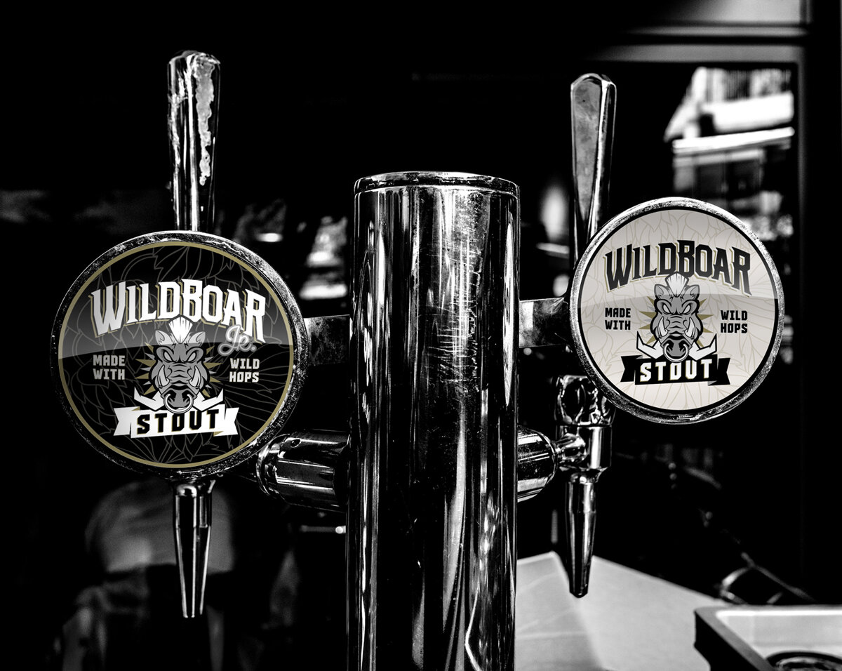
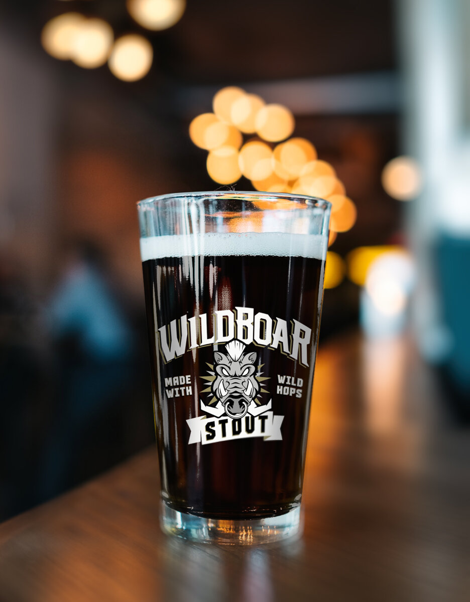
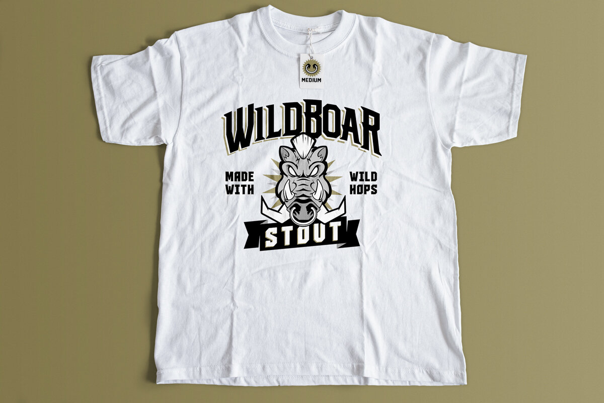
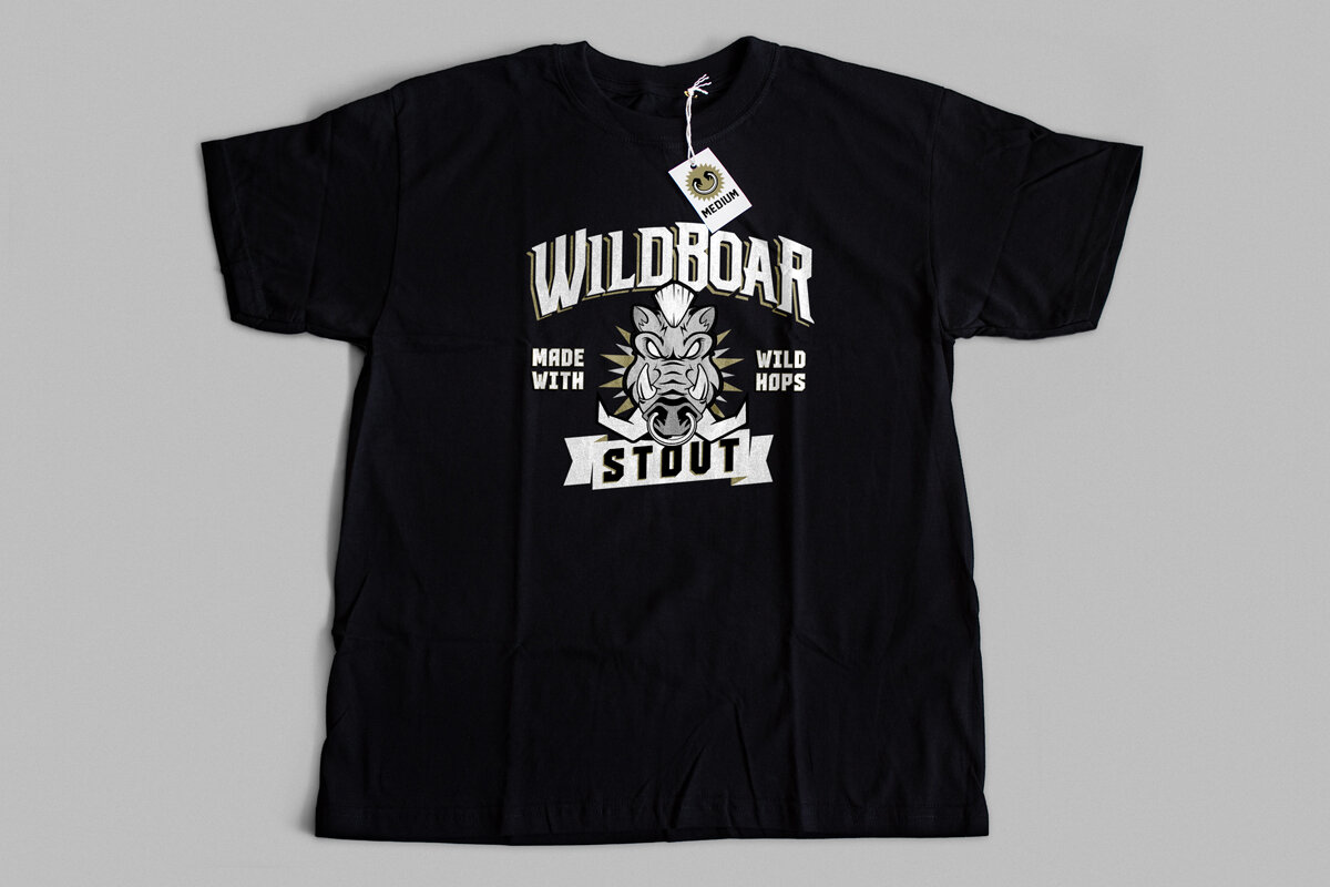
WildBoar Stout’s presence continues well beyond the bottle and fits in rather nicely at pubs and other fine beverage establishments. Here graphic standards are applied to drinking vessels and the famous WildBoar Stout “Double-Tap.”
Stout-Outs
OUR MARKETING STRATEGY
Socially Acceptable
One of my design philosophies centers on the principle of “Work With What you’ve Got.” Since the cap presented itself as a rather strong, memorable and inherent attribute of the brand’s “spirit” and fun nature I decided to go ahead and extend the concept to both outdoor and social media application. The result was something memorable, unique and quite playful; all attributes of a personality that would bring welcome life to any gathering.


Full-Bodied Website With a Twist of eComm
The main communication focus of the WildBoar website centered on its “Standout” nature. Content focused on character qualities, process, ingredients and flavor.
